
25+ Famous Bank Logos & Their Hidden Meanings [2026]

A bank’s visual identity: it’s logo, colors and typography must present the company as trustworthy and professional – this is imperative.
In this article I talk about best bank branding examples.
Banks face a particular challenge when it comes to branding because the subjects of money is sensitive, therefore branding for banks is particularly important.
If your financial institution logo looks unprofessional you won’t project the right image and connect with your customers.
In this article I describe some of the most popular bank logos.
Never does a color play such a significant role as in the logo of a financial institution.
Most of the banks opt for blue as their primary color.
This is by no means a coincidence, according to color psychology, blue instils sort of serenity and reliability in people.
It’s conservative and serious, thus appropriate to branding a company that handle people's finances.
Typography can really manipulate the significance of what it communicates.
Due to its effects on the context of communication, the right font can make wonders.
Simple sans-serif fonts is what most banks opt for.
Choosing the right typeface can communicate your brand's strengths and also increase your brand's memorability.
It is important to know what an individual form means and how our brains read them.
Square shapes convey feeling of solidity and stability.
If we are talking about the popularity of various shapes, we can say that a rectangle is the most popular shape in branding of banks.
Let's look at some of the top banks and their logos:
Bank of America's name is self explanatory, it's an American multinational investment bank and financial services company.
The colors are taken from the US flag and evoke feelings of patriotism.
The mark symbolizes American flag and farm field.
The logo taps into the nations patriotic feelings as well as to cement the fact that bank is a wholly American institution.
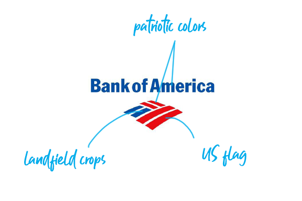
Why farmer's field? - many farmers trust and work with the bank and the image was meant to resound with them.
See the logo in use:
The logo was introduced in 2001 after the bank restructured.
Chase Bank is a national bank headquartered in Manhattan, New York City.What's the Chase Bank logo meaning?
This powerful octagonal-geometric form was perhaps the first abstract symbol used in modern banking.
The abstract shape embodies feelings of motion and activity.
The form is divided in such a way as to suggest forward motion within the framework of control.
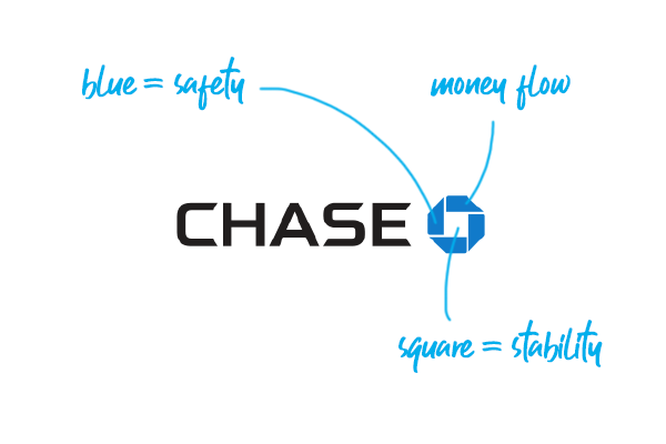
The activity is centered around the square, implying growth from a central foundation.See the logo in use:
The Chase Bank logo was designed in 1961 by a CGH, a New York based design studio.
Also check the Chase bank logo sketch in my other article.
Citibank was founded in 1812 as the City Bank of New York and later become national bank.
The name is written in blue letters, and a red arc caps the "t" letter.
The umbrella secures customers from financial upheavals.
The arc is a simplified umbrella image borrowed from the logo of Travelers Group - one of the merging companies)
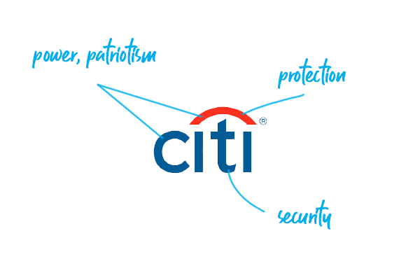
The blue color stands for trust; the red color stands for passion.
See the logo in use:
The Citi Bank logo was designed by Paula Scher on a napkin and cost $1,5m.
Also check the Citi bank logo sketch in my other article.
The bank’s “TD” initials stand for Toronto-Dominion Bank and it’s a Canadian bank that expanded to the United States in 2008.
The ligature symbolizes connection and coherence.
Squares signify the idea of an enclosure, home, and settlement; the green color symbolizes money and vitality.

The square is the most "stable" form of visual language and it represents an order and discipline.
See the logo in use:
The green color and distinctive symbol makes TD bank visible from far as practically no-other bank in America uses anything similar.
Deutsche Bank AG is a German investment bank and financial services company headquartered in Frankfurt, Hesse, Germany.
The combination of slash and square is a long-established symbol of the Western economy.
What's the Deutsche Bank logo meaning?
The “slash” stands for consistent growth, the square for stability.
Squares are commonly used in banking logo design in order to built trust and stability and this logo is perhaps the best example of it.
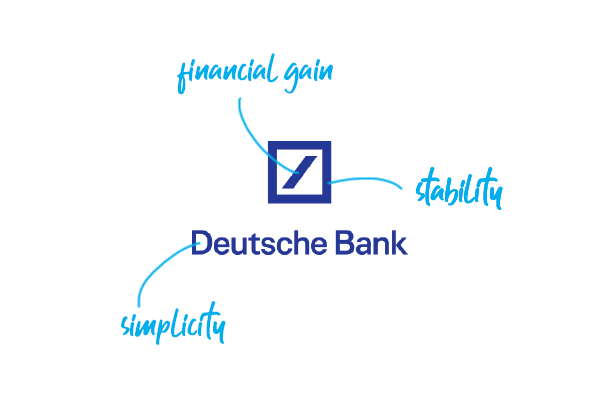
It's simplicity and uniqueness makes it to just burn into your mind.
German bank logos are pretty straightforward and minimalist.See the logo in use:
The Deutsche Bank logo was designed by Antony Stankowsky in 1972.
The ING Group is a Dutch multinational banking and financial services corporation headquartered in Amsterdam.
The lion goes way back to ING’s Dutch roots - lion is the country’s national symbol.
The lion symbolizes strength, courage and authority.
The orange color is the national color of Netherlands where the banks if from.
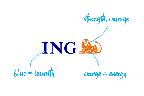
Orange stands for energy and vitality according to the psychology of color.
See the logo in use:
The ING name stands for "Internationale Nederlanden Groep" in dutch.
Read more about the history of ING brand.
Societe General is a French multinational investment bank and financial services company headquartered in Paris, France - this is the only french bank logo I talk about in here.
The square evokes solidity, strength and rigor while the color contrast indicates the balanced relationship between the bank and its clients.
The two halves stand for harmony and the white bar for openness.
Red, which is bright and dynamic, is associated with passion and emotion, while black is the color of solemnity, seriousness, and institutions.
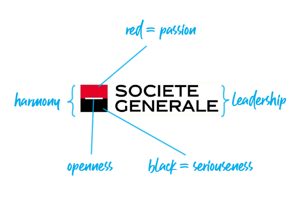
The larger typeset suggests the bank's capacity for flexibility and adaptation.
All caps stand for leadership and authority.
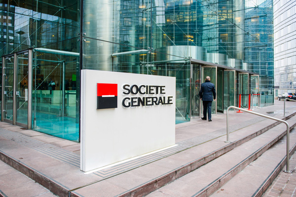
The current logo was designed in 1989 by Sopha, a design agency owned by the RSCG group.
Read more about the history of Societe Generale logo on the bank's website.
UBS Group AG is a Swiss multinational investment bank and financial services company founded and based in Switzerland.
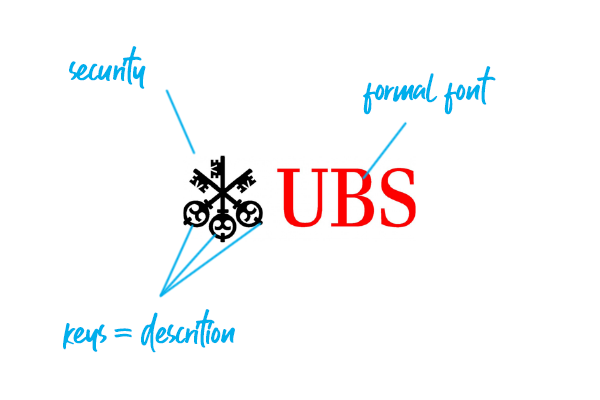
UBS is a bank from Switzerland that features three keys in its logo.
The keys stand for the company's values of confidence, security, and discretion.
What's the UBS logo meaning? T
he three keys bear a traditional meaning - they unlock the doors to wealth, health and luck according to the historical belief.
See the logo in use:
The UBS logo is very unique in every aspect of it, starting with the serif font, red color and keys symbol that no-other financial institution used before.
The symbol used in the Raiffeisen bank logo is called the Gable Cross.
The two crossed horde heads symbolize protection and safety.
This symbol that inspired the logo has a traditional meaning and was used on the roofs of European houses.
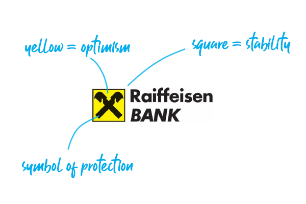
According to the belief the roof gable was to protect the occupants against all dangers.
See the logo in use:
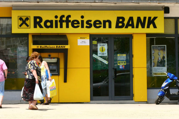
The Gable Cross was chosen as a trademark in 1877 – when Friedrich Wilhelm Raiffeisen (the founder) was still alive.
The branding of Gettin Bank is quite fresh and it sort of breaks with boring squares and blue in banking logos.
It's a perfect example of a modern bank logo.
The arrow symbolizes forward moving and call to action.
An arrow symbol in banking is kind of refreshing and unique.It also works great with the name.
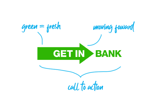
The fresh green makes the logo stand out among competitors - who else uses blue in banking?
See the logo in use:

Gettin Bank is a small polish bank, but I decided to include it in my list, just to show you that a banking logo doesn't have to be boring.
Make no mistake: your financial institution’s logo and brand identity is one of the most powerful (if not subtle) weapons in your marketing arsenal.
By describing logos of different banks my goal was to make you aware of the importance of branding a bank or financial institution – it’s always good to learn form the best!
Do not underestimate the impact it has — whether positive or negative — on people’s perception and your bottom line.
Logo and colors must present the bank as trustworthy and professional.
A logo is the heart and soul of your bank, the image that differentiates you from other financial institutions.
But logo is just a part of the story and logo alone is not a brand.
Before jumping right into designing your logo, you should work on your brand strategy first and define who you are and who you want to connect with.
Are you looking to hire a designer? Check out my services page and shoot me an email.
As an Amazon Associate, I earn from qualifying purchases.

