

Logo Design
Best Tech Startup Logos & Why They're So Good in 2026
Published on Jan 27, 2026
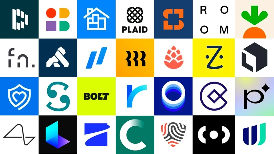
Logo is a crucial element that can contribute significantly to a company's success or failure.
In this article, I feature some of the best logos I found on WellFound and I examine them purely from a visual standpoint.
My goal is to inspire your own logo design journey by highlighting exemplary work in the field.
As we explore these designs, we'll uncover what makes a tech logo truly stand out in today's crowded digital landscape.
Whether you're a budding entrepreneur or a seasoned designer, this curated list offers inspiration and insights into creating impactful, versatile logos.
1. Dashlane
Dashlane's mission is to "Make security simple for millions of organizations and their people."
Their logo brilliantly incorporates elements that suggest simplicity and security.
The logo consists of a stylized letter "D" created using white rectangular shapes on a dark teal background.
Key aspects:
- Simplicity with basic geometric shapes
- Modern, minimalist aesthetic
- Versatile design for various applications
- High contrast for visibility
This logo effectively communicates Dashlane's brand identity as a modern, secure, and streamlined password management solution.
2. Neighbor
Neighbor is described as a "Nationwide consumer marketplace disrupting self-storage."
Their logo captures this concept with a simple yet effective design.
It features a stylized house icon in white, set against a vibrant blue background.
Key aspects:
- Symbolic house shape
- Internal divisions suggesting storage
- Bright blue color conveying trust and professionalism
- Conceptually relevant to their business model
- Friendly, approachable aesthetic
This logo effectively represents Neighbor's community-based storage solution, visually embodying the idea of using spare space in homes for storage.
3. Instabase
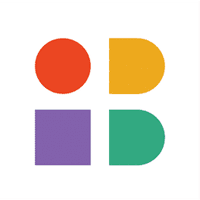
Instabase's logo consists of four simple geometric shapes arranged in a square grid: a red circle, a yellow/orange semi-circle, a purple square, and a green square, all set against a white background.
Key aspects:
- Simple geometric shapes
- Vibrant and diverse color palette
- Modular arrangement suggesting flexibility
- Abstract representation of data transformation
- Modern, tech-savvy appearance
This logo effectively communicates Instabase's identity as a versatile, modern platform for handling diverse data and applications.
4. Plaid
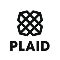
Plaid's logo consists of a geometric symbol of interlocking black lines forming a square shape, with the word "PLAID" in bold, uppercase letters below it.
Key aspects:
- Simple black and white color scheme
- Interlocking pattern representing connectivity
- Clever visual pun on the company name
- Balanced composition of complex symbol and simple text
This logo effectively represents Plaid's role in linking financial services and aligns with their mission to unlock financial freedom.
5. Snapdocs
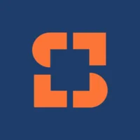
Snapdocs' logo features a stylized "S" formed by geometric orange shapes on a dark blue background.
Key aspects:
- Composition of four shapes forming an abstract "S"
- High-contrast color scheme of orange and navy blue
- Modern, tech-savvy feel through geometric design
- Interesting use of negative space
- Clean, uncomplicated design
This logo effectively communicates Snapdocs' brand identity as a modern, efficient platform for real estate transactions.
6. Labelbox
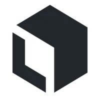
Labelbox's logo features a minimalist, geometric design of a cube with the inside forming the letter L like Labelbox.
It effectively communicates the company's focus on AI and data management.
Key aspects:
- Stylized cube/hexagon shape with one side left open
- High-contrast black and white color scheme
- Modern, tech-oriented feel through geometric design
- Clever use of negative space
- Symbolism of an open cube suggesting flexibility and potential for growth
This clean, uncomplicated design is versatile for various applications and easily recognizable across different media and sizes.
7. ROOM
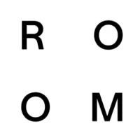
ROOM's logo showcases a minimalist typographic design with the four letters of the company name arranged in a square formation.
It aligns perfectly with their mission of rethinking workplace design.
Key aspects:
- Four bold, sans-serif letters (R, O, O, M) in black
- Letters arranged in a 2x2 grid format / in th corners.
- Symmetrical layout with perfect balance
- Suggests modularity and flexibility
- Easy to read and remember
The square arrangement of letters subtly evokes the idea of room spaces or building blocks, reinforcing ROOM's focus on innovative, modular workplace solutions.
8. BigID
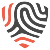
BigID's logo features a stylized shield shape filled with an abstract fingerprint-like pattern, effectively communicating the company's focus on data intelligence and security.
Key aspects:
- Shield-shaped outline suggesting security and protection
- Abstract swirling pattern reminiscent of a fingerprint or data flow
- Three-color scheme: white background, black lines, and coral-red accents
- Clever integration of 'ID' concept through fingerprint imagery
- Visually striking and memorable
The combination of the shield shape and fingerprint pattern powerfully conveys ideas of data protection, identity, and uniqueness.
9. Rippling
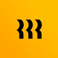
Rippling's logo showcases a bold, minimalist design with three stylized 'R' shapes on a vibrant yellow background, representing their all-in-one platform for HR, IT, and operations.
Key aspects:
- Three abstract 'R' shapes in black, aligned horizontally
- Bright, attention-grabbing yellow background
- High contrast between the black logo and yellow backdrop
- Suggests motion, continuity, or 'rippling' effect
- Simple yet distinctive design, easily recognizable
The rippling effect implied by the design suggests fluidity and connectivity, while the bright yellow color stands out in the tech industry, conveying energy and innovation.
10. Bolt
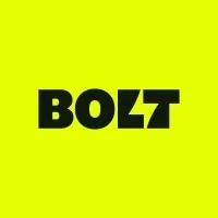
Bolt's logo features a bold, typography-based design with the company name set against a vibrant neon background, perfectly capturing their mission to make online buying easy and efficient.
Key aspects:
- Company name "BOLT" in thick, black, sans-serif letters
- Striking neon yellow-green background color
- Stylized "L" and "T" form a lightning bolt in the negative space.
- Modern, energetic design that catches the eye
This impactful logo effectively communicates Bolt's brand identity as a fast, efficient, and modern e-commerce solution, standing out in the digital marketplace with its vibrant color choice and clever lightning bolt integration.
Conclusion
These startup logos demonstrate a range of design approaches, from abstract and minimalist to more illustrative and symbolic.
What they all have in common is a strong connection to their brand's mission and values.
Effective logo design goes beyond aesthetics - it communicates the essence of the brand in a visually compelling way.
If you're in need of a logo designer for your startup, feel free to check out my portfolio and get in touch.
Building a SaaS brand?
I design logos, app icons, and brand identities for SaaS and AI startups. Your brand identity in one week, guaranteed, for $3,000.