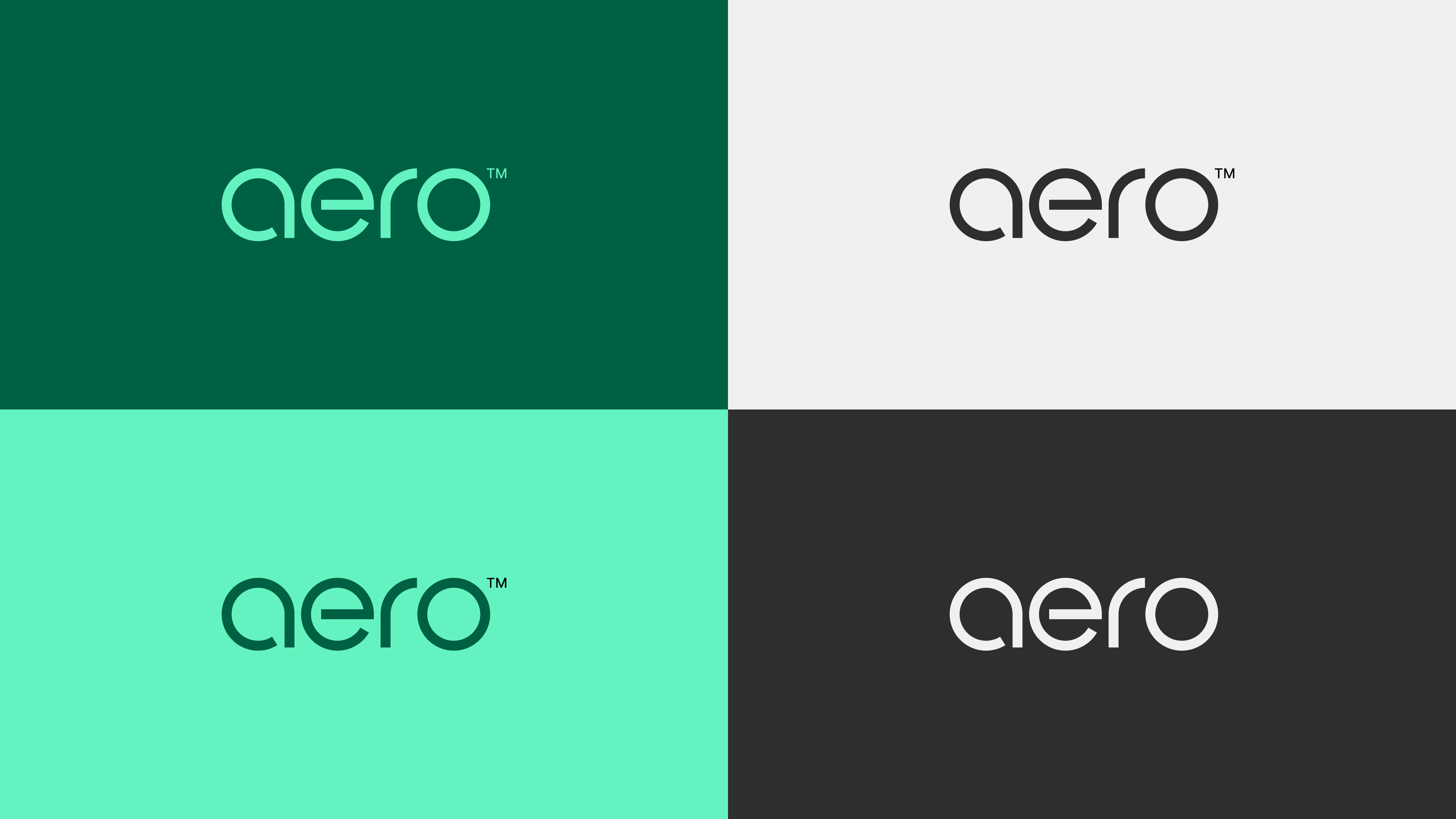
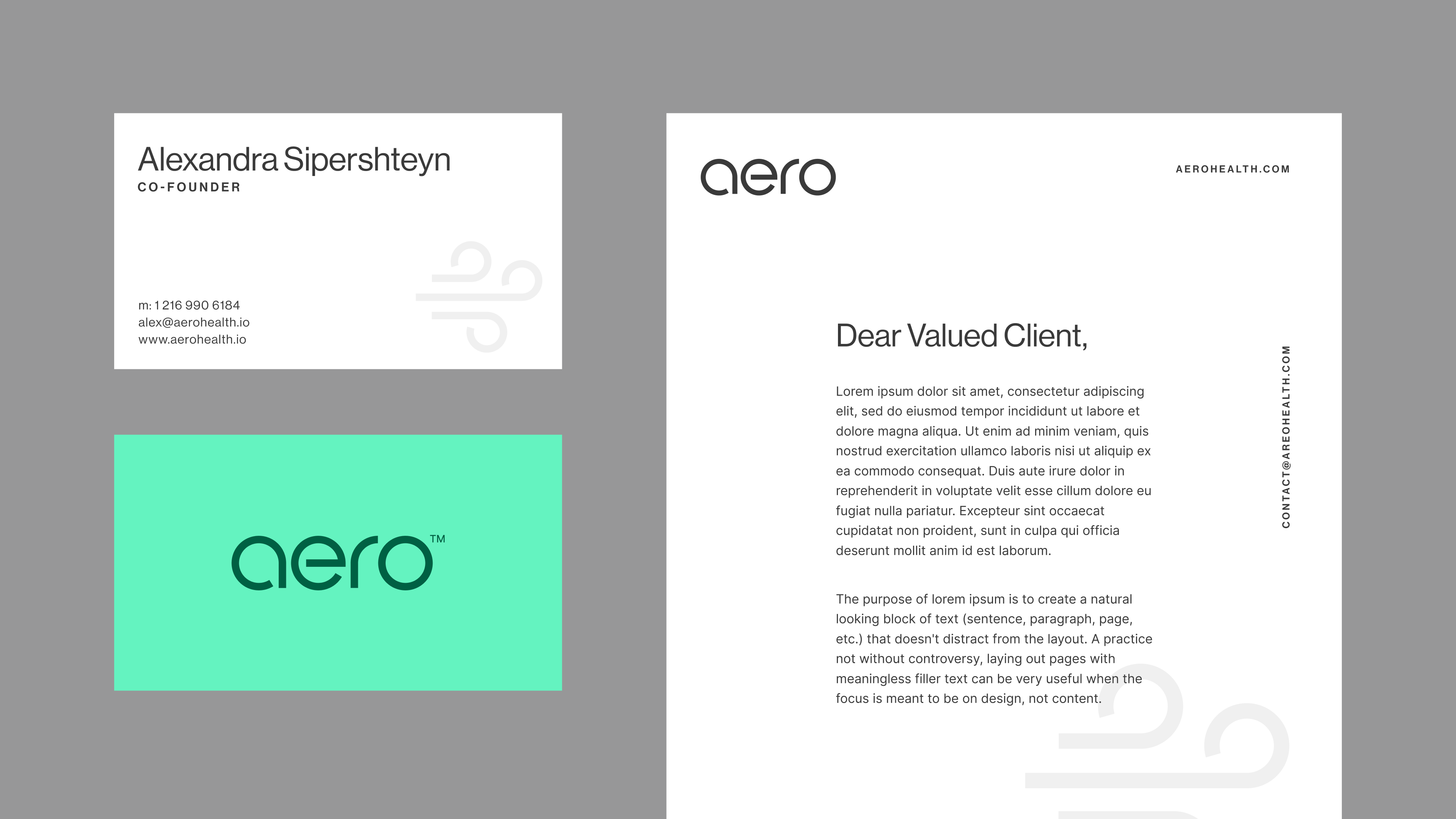
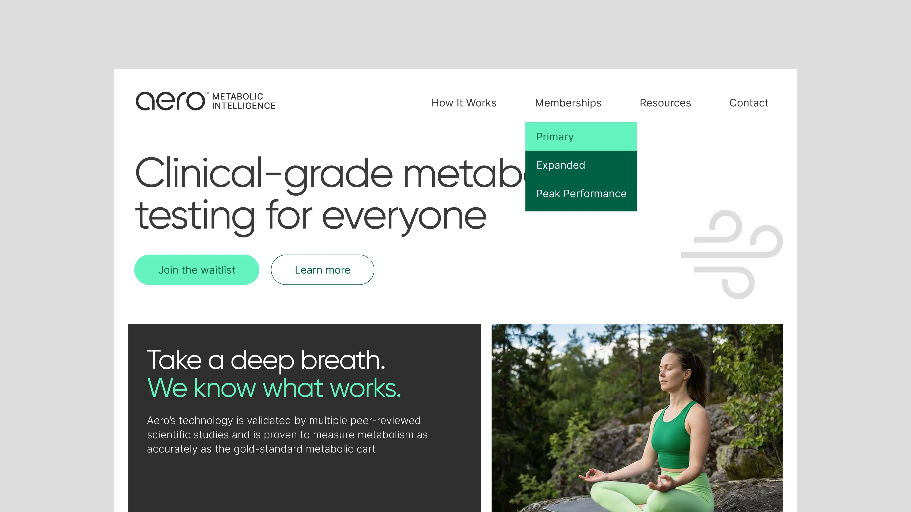
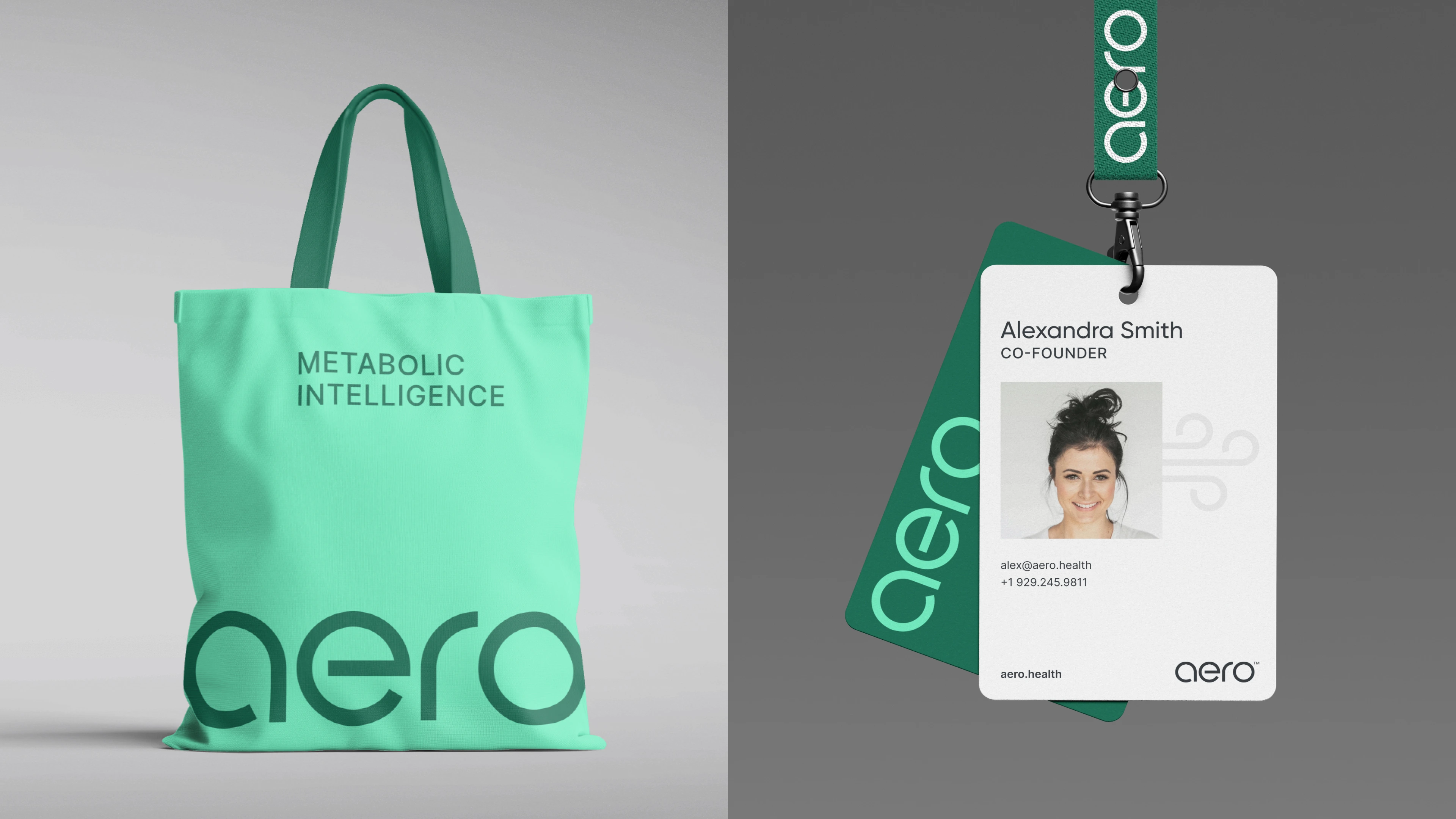
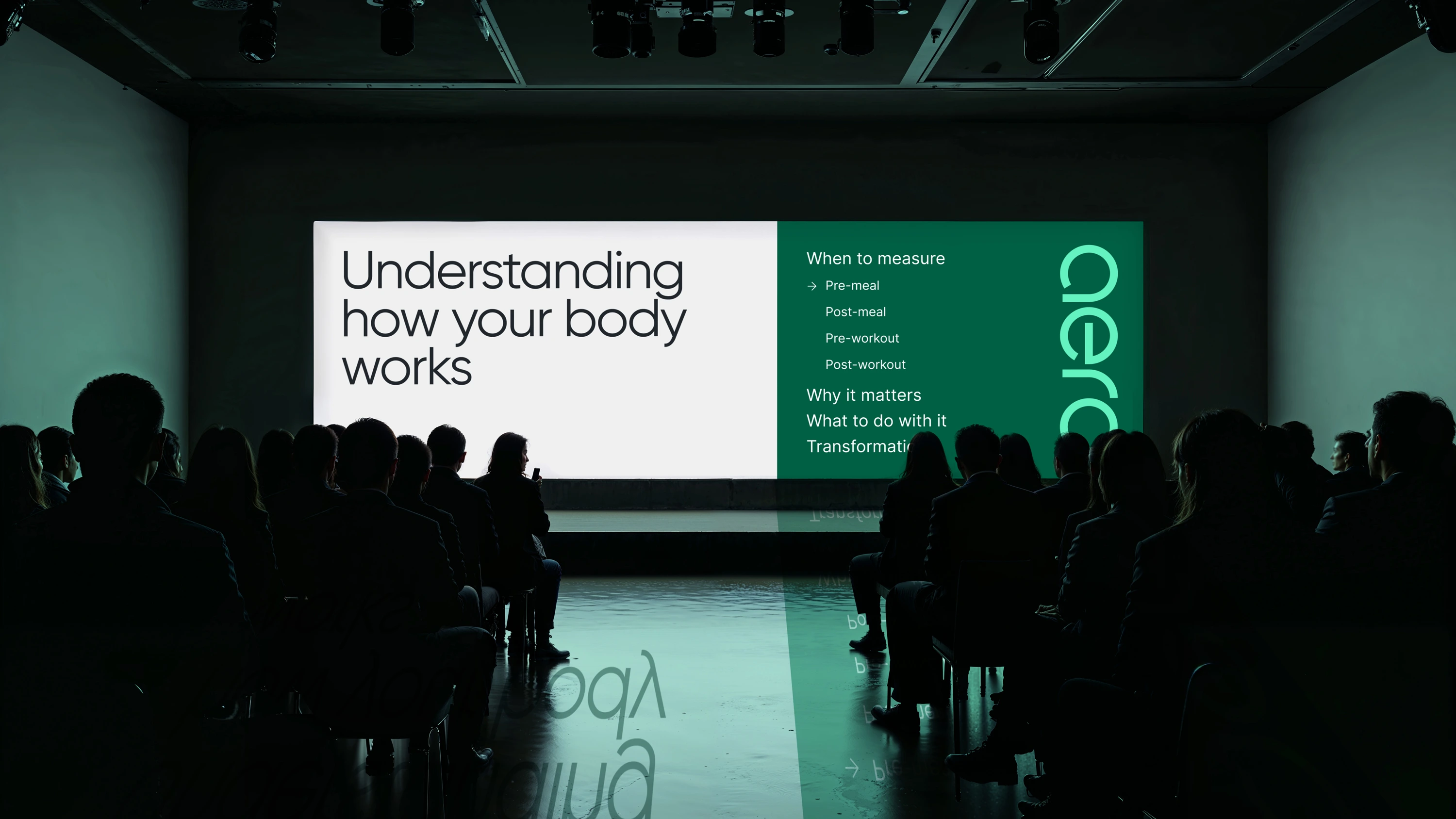
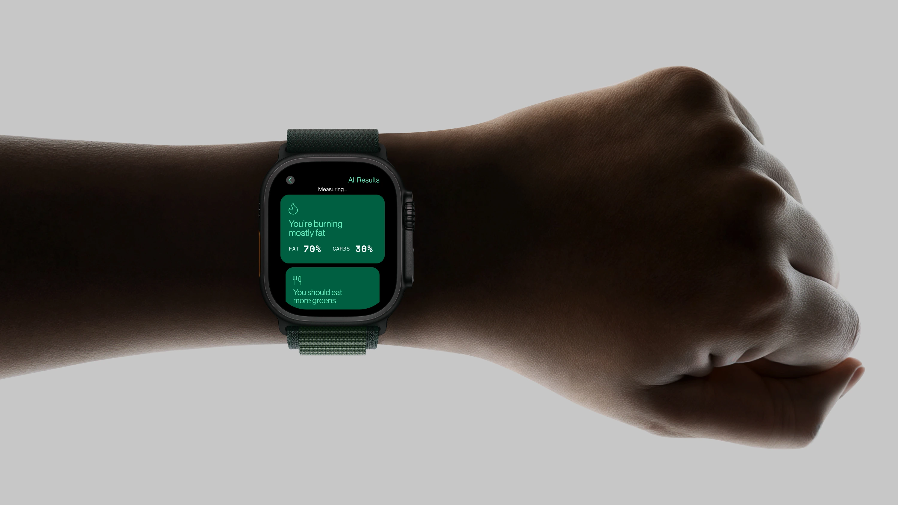
Aero is a breath-analysis company focused on delivering precise, non-invasive health insights through advanced sensor technology. The identity was designed to feel clean, clinical, and trustworthy—reflecting the brand’s scientific foundation and data-driven approach. A custom lowercase wordmark balances technical precision with approachability, using refined geometry and subtle optical adjustments for clarity at any scale. The green color palette was intentionally chosen to evoke a lab-grade, medical environment, reinforcing accuracy, reliability, and calm confidence. The result is a modern, credible identity that positions Aero at the intersection of healthcare, technology, and innovation.